Omni Channel Experience For Tata Nutrikorner
Redesign for Tata Nutrikorner with an emphasis on optimizing mobile web presence.
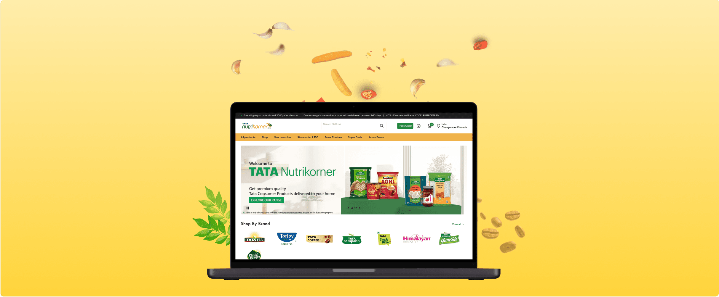
👩🏻💻 Click here to visit tatanutrikorner.com

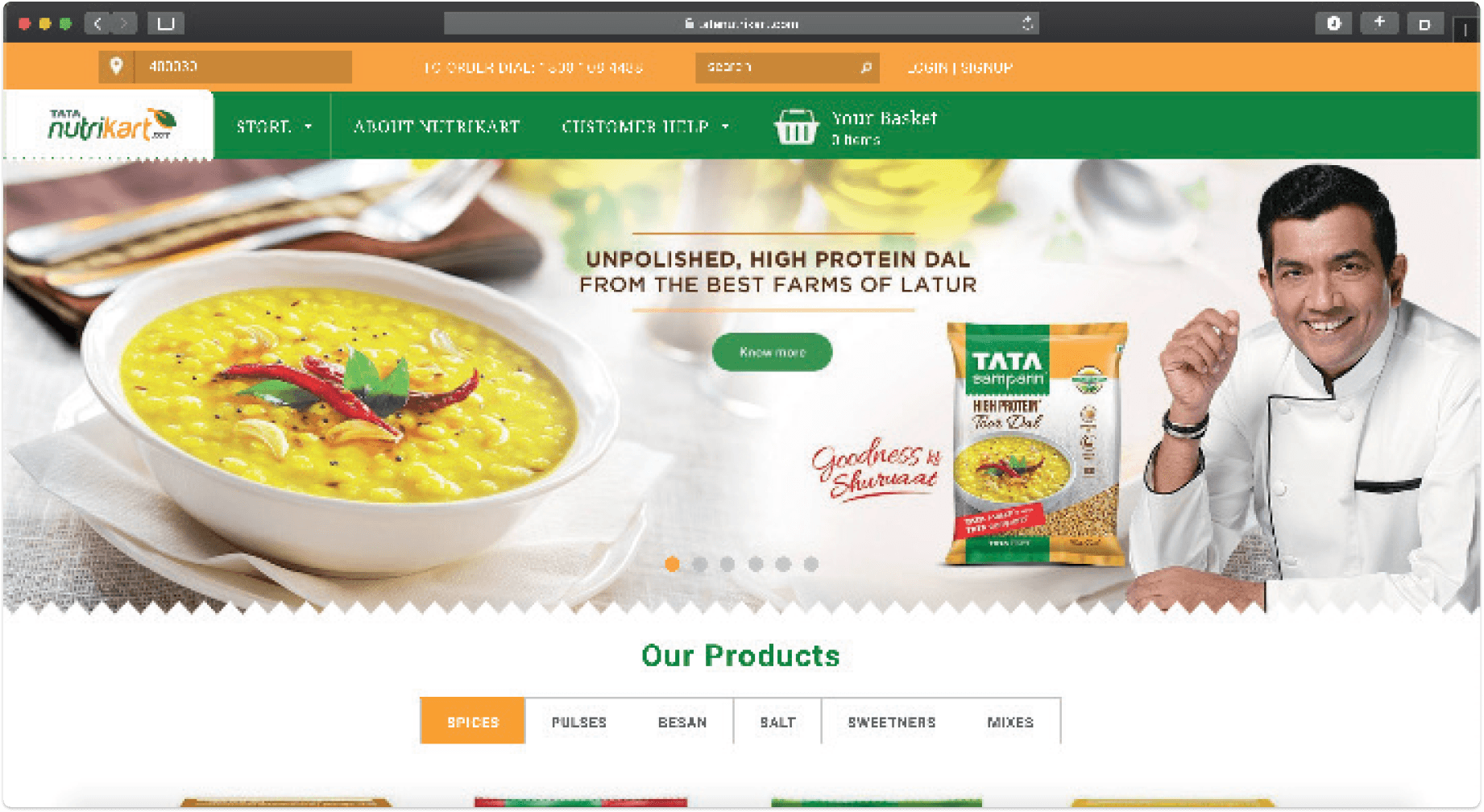
Old Site, 2015
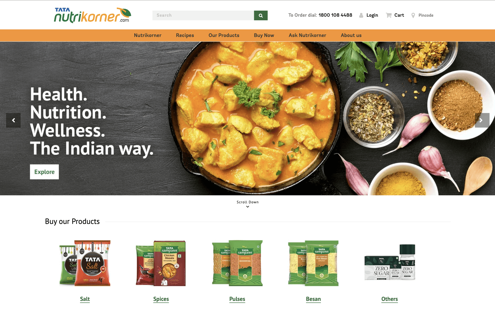
Revamped Site, 2019

Simple and intuitive navigation.
Improved typography, style guide, and high-quality images.
Clear icons and calls-to-action drive engagement.
Introducing "Ask Nutrikorner" for user blogs.
A dedicated space for discovering delicious 'Recipes'.
24/7 Support: Continuous site and delivery assistance.
What's new?
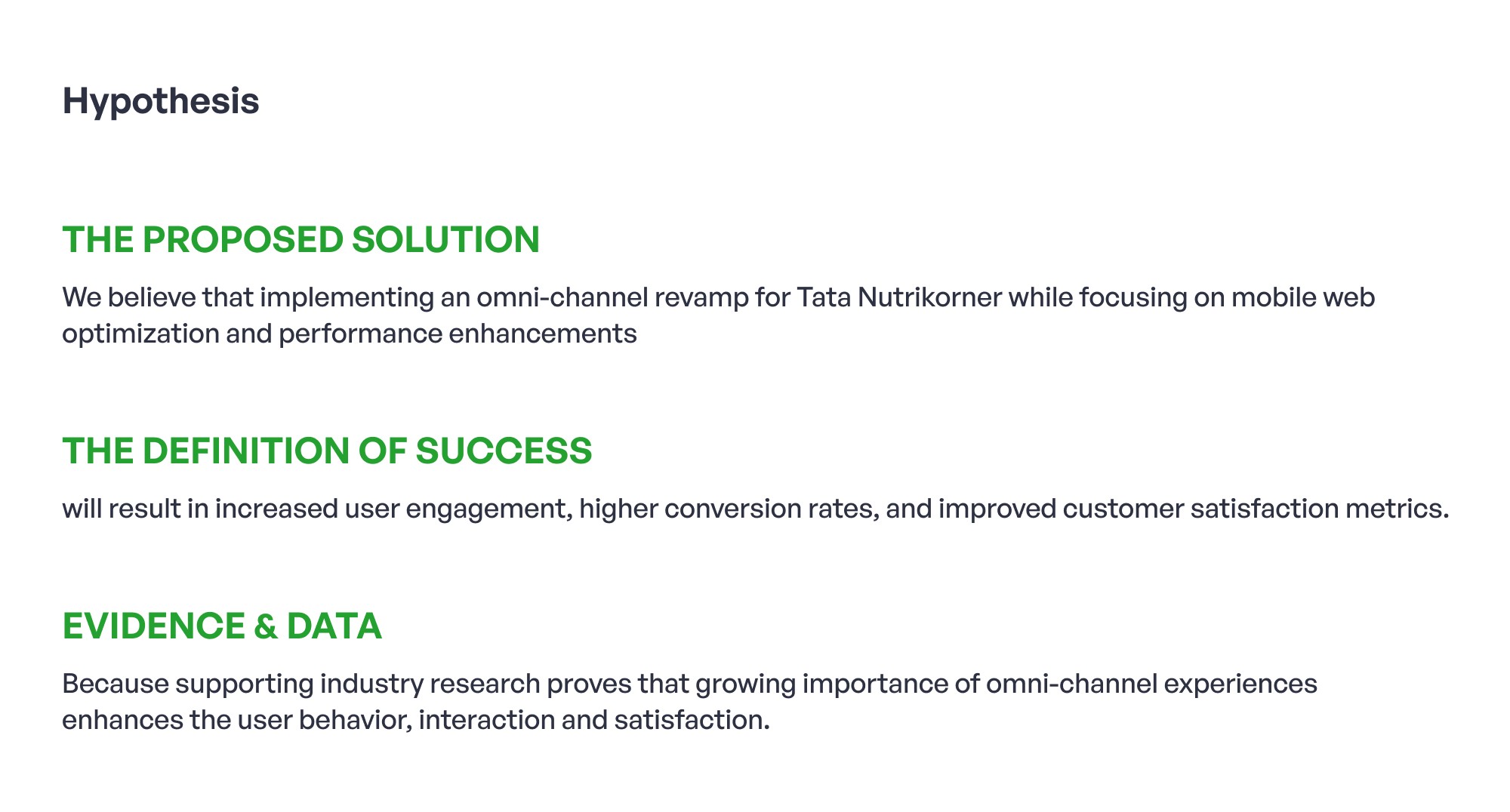
Case Studies Of Focused Areas
*Tata Nutrikorner was initially Tata Nutrikart
While working on the project, I worked on 3 Case Studies. Click one to know more




Omni Channel Buying: Location
Users can skip entering their pincode and browse the site freely.
If a user skips the pincode, a prompt will appear when they select a product to purchase.
In unserviced areas, users can switch to the SuperKart feature to shop on Nutrikorner and complete payments on Amazon/BigBasket.
Omni Channel Buying: Category
Product categories on the homepage streamline the user’s purchase journey.
Users can easily identify trending items (Best Selling) along with their benefits.
Educational content helps influence user purchase decisions effectively.
Omni Channel Buying: Nutriklub & Blogs
Users see a regular price and a lower club price, creating a sense of deprivation that encourages them to register for membership.
Carousel creatives can effectively highlight membership benefits, enticing users to register for exclusive discounts.
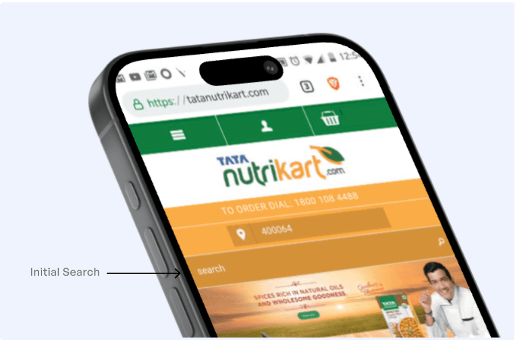
Omni Channel Buying: Search
Indicative and prominent search bar.
Search bar connects user to the product offerings right away
Omni Channel Buying: Filters
User journeys are streamlined with filters (price, size, qty.) for easy product volume selection.
Users gain insight into in-demand items through a "Best Selling" section, complete with product benefits.
Educational content influences user purchase decisions effectively.
Users can buy items directly from the homepage without navigating to product description pages.
A new section highlights exciting discount projections for users.
Countdown timers for deals create urgency (e.g., "00:10 minutes to Top Deals").
Mobile Site Interface
© 2024 by Kasturi Koli. All rights reserved.
Alternatively, here is a fancy sheet of paper 📜
Resume.
Let's build a better
future together!
Thanks for reaching the bottom of this page. If you like what you see,
Thank you for scrolling ·
Thank you for scrolling ·
Thank you for scrolling ·
Thank you for scrolling ·
Thank you for scrolling ·
Thank you for scrolling ·
Thank you for scrolling ·
Thank you for scrolling ·
Thank you for scrolling ·
